













No products in the cart.

Shop this story
As Aug 31 nears, ‘quiet decor’ is replacing styled shelving for renters
by Anabel Figueroa
By late August, a lot of summer movers hit the same wall: the boxes are half-open, the lease says no holes, and every scroll for quiet decor ideas for renters somehow swings between spa-like calm and shelves posed like a small museum. That tension matters when you’re trying to make a rental feel settled fast, without buying a personality for the living room.
Quiet decor has started to mean something more useful than expensive minimalism. For renters, it points to rooms that soften glare, absorb noise, and let storage fade into the background, while still looking intentional. The hard part is that style advice still sends mixed signals. Much of that advice comes down to picking whichever look wins the season. The real question is which choices make an apartment easier to live in after the moving adrenaline wears off.
Definition drift: “Quiet decor” shifts from status to soothing
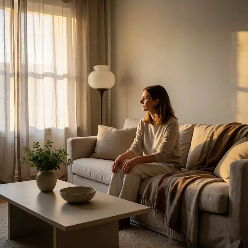
Picture the week before your lease starts: you’re measuring your new living room on your phone screen, scrolling rental-decor feeds at midnight, and somewhere between the fifteenth post about linen throw pillows and the twentieth about “quiet luxury,” you start to wonder whether those two things mean the same thing. They don’t, and the gap between them is exactly where a useful design idea lives.
“Quiet luxury,” as shelter media defines it, is an aesthetic category: neutral colors, natural materials, sculptural silhouettes, and a deliberate reduction of visual noise. It’s premium-coded minimalism, the kind of look that reads as expensive precisely because it’s edited down to only the pieces that can breathe. Apartment Therapy, House Beautiful, and their orbit have used this framing to describe the full lifestyle aspiration, the idea that restraint itself signals taste.
What’s happening now, quietly (and the pun is hard to avoid), is a vocabulary drift. Publications are starting to pull “quiet decor” ideas for renters away from that status register and point them toward something more immediate: comfort and sensory management in spaces you can’t permanently alter. House Beautiful links muted earth tones, lighting kept under 3000K, rounded silhouettes, and tactile fabrics like bouclé and linen not to aspiration but to feelings of serenity and emotional safety. Wirecutter frames thick rugs, blackout curtains on tension rods, and warm lighting as acoustic interventions first, aesthetic choices second. In this context, “quiet” is not a lifestyle aspiration but a livability fix, one that happens to look good.
Design media hasn’t fully committed to one lane, though. The same outlets running restraint-forward guides will, on the next scroll, spotlight a rental transformed by bold peel-and-stick wallpaper and enveloping velvet drapery, which is about as far from low-stimulation as a rental gets. The editorial tension is real, and it’s worth sitting with: the framing that’s gaining ground treats softness and absorption as your first tools, but what counts as “quiet” on your walls depends entirely on what you’re trying to quiet down.
Shelf styling after the shelfie: Three frameworks that keep eyes moving

The shelf-styling guides that started circulating seriously in late 2025 share one underlying goal: get the eye to move rather than land. Three frameworks have become the most referenced, and understanding what each one is actually doing explains why quiet decor ideas for renters keep gravitating toward them.
House Beautiful’s triangle method starts with the tallest object in a grouping and arranges everything else in odd numbers from there. The logic is that asymmetry reads as considered rather than accidental, and odd numbers resist the static, mirrored quality that makes a shelf look like a display case instead of a room. The rule about starting tall is more practical than it sounds: anchoring your eye at the top of a grouping first makes you perceive the negative space around each object as intentional, not leftover.
Apartment Therapy’s TLC method covers similar ground from a different angle. Tall object, layers, something curved. The three letters function as a checklist that also describes a physical hierarchy. Height gives the eye a starting point, layers add depth so the shelf doesn’t read flat, and the curved element (a vase, a round frame, a bowl) keeps the arrangement from feeling rigid. Apartment Therapy presents TLC as a guide rather than a strict formula, which is an honest framing: three frameworks producing different sequencing priorities means the real skill is knowing when to relax whichever rule is making your shelf look like homework.
The rule of thirds adds a spatial dimension the other methods skip. Divide the shelf and the air above it into a grid, then place objects at the intersection points. It’s the same compositional principle photographers use, and it works on shelves for the same reason: the intersections feel natural to the human eye without being symmetrical.
What all three methods share is a quiet insistence that a shelf styled well should feel more like a vignette than a storage solution. A single ceramic piece on a low shelf, slightly off-center, a stack of books horizontal underneath it, a dried stem curving into the space above: that’s the arrangement. The objects don’t announce themselves. They just settle.
Constraint-driven aesthetics: Modular storage that reads built-in
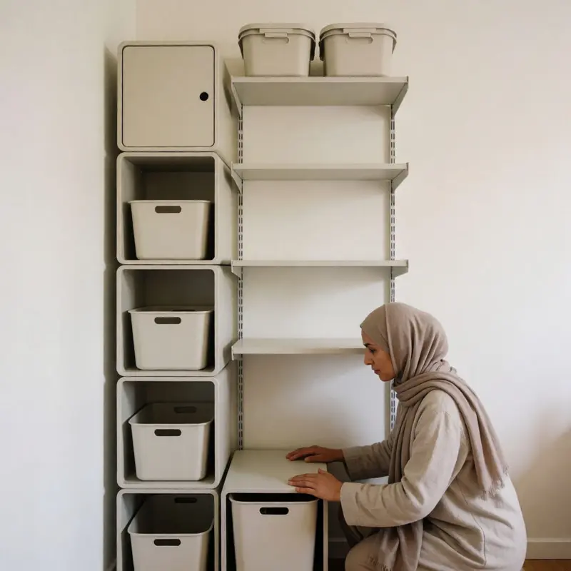
A shelf styled like a vignette still needs somewhere to live, and that’s where the constraint becomes real. Renters can’t commission the floor-to-ceiling wood built-ins that Elle Decor describes as the enduring benchmark of integrated design, so the question becomes which freestanding systems come close enough that the eye stops caring about the difference.
IKEA’s ELVARLI is the one that keeps appearing in makeover features precisely because it sidesteps the usual tradeoff. The system uses tension poles braced against the ceiling rather than anchored to the wall, which means the shelving gets to read as structural without touching the drywall. Apartment Therapy documented a living-room transformation using it and called it outright rental-friendly; the homeowner described it as customizable, which matters because a fixed-width unit can’t respond to an odd corner the way modular columns can. That said, none of these systems fully disappear: a tension pole braced to the ceiling is still a tension pole, and anyone walking close will read it for what it is. The illusion works at a distance and in photographs, which is often enough.
For situations where ceiling height or landlord rules make tension hardware impractical, the path runs lower. ClosetMaid’s Stackable Vertical Organizers let you build column by column without drilling, and the modularity means you’re not committed to a single footprint when the next apartment has a different wall. Inside an existing IKEA Kallax unit, Lax Rax kits add individual subdivisions without altering the cube’s structure, so a bookshelf that looked generic last month can suddenly hold everything at the right scale.
Bathrooms are a different problem with a surprisingly tidy solution: over-the-toilet storage cabinets claim vertical space that would otherwise go unused, with no hardware required. The same logic extends to a drill-free organizer that Apartment Therapy surfaces in its renter-specific collection for around $15, proof that the entry point for nonpermanent storage doesn’t have to be a design investment.
The Container Store’s Elfa sits at the other end of that range: fully modular, available in configurations that span pantries and closets alike, and designed to be reconfigured rather than discarded when your layout changes. What these systems share, across every price point, is the same quality the vignette methods are after: the sense that the storage belongs there.
Signal vs. substance: Why quiet decor wins backlash

There’s a reason the bookshelf became a status symbol before it became a punchline.
For a few years, TikTok’s “bookshelf wealth” posts turned a well-stocked shelf into a broadcast of taste: the right spines, the right objects, the right color-coordinated chaos signaling that you were the kind of person who read, collected, thought deeply. ELLE Decor framed the phenomenon honestly, noting that these posts positioned styled shelving as an indicator of sophisticated intellect. That’s not nothing. The shelf was doing real cultural work.
But performative shelf-styling has a ceiling, and designers started naming it. The critique that landed hardest was straightforward: fake or purely decorative books read as tacky because they’re props pretending to be a life. Real shelves, the argument goes, should hold real things, objects that mean something rather than objects that photograph well. When the styling is purely for the image, the viewer feels it, even if they can’t say exactly why.
That backlash quietly shifted what “good taste” looks like, and quiet is the operative word. Interior Design’s 2025 residential roundup described a return to minimalistic sensibilities as a mainstream direction, and importantly framed it as something that still uses texture and color rather than stripping a room bare. Quiet decor ideas for renters aren’t about blankness; they’re about rooms that don’t demand to be looked at. A BILLY bookcase painted the same color as the wall, as one Apartment Therapy makeover demonstrated, visually disappears into the architecture. The storage is real, the books are real, and the room just feels settled.
Maximalism isn’t going anywhere, and boutique-hotel-style dorm rooms still rack up views alongside every pared-back alternative. But quiet has earned a different kind of cultural capital, one that doesn’t depend on an algorithm noticing it. The shelf that looks like it’s always been there, the room that feels like it belongs to someone rather than something, that’s a harder trick to pull off, and harder tricks tend to age better.
Final thoughts
A shelf that lets the eye keep moving, a bookcase that blends into the wall, and a lamp that warms the room below the harsh end of bright all point to the same shift: renters are rewarding decor that lowers friction. The appeal is relief you can feel on a Tuesday night when the place finally stops buzzing at you.
That gives quiet decor ideas for renters a longer shelf life than the last wave of styled displays. When a room asks less of your attention, your real things can do more of the talking, and the apartment starts to feel stable before it feels finished. For people moving in at the edge of summer, that’s a pretty solid definition of home.
Further reading
Leave a comment