






No products in the cart.

Shop this story
Bold vs neutral: Which home decor style wins in 2025?
by Anabel Figueroa
The 2025 design landscape reveals a quiet revolution that reshapes how designers approach space. We’ve moved decisively beyond the tired debate of bold vs neutral decor for 2025 into a sophisticated harmony where emerald green accents dance across minimalist backdrops and terracotta whispers warm layered dining spaces. Texture emerges as the unsung hero, with matte finishes and 3D panels preventing sterile minimalism while sustainability breathes through recycled materials.
This evolution transforms rooms into emotional landscapes where color drenching immerses bedrooms in sage to hunter greens and curved shapes soften edges. Designers now weave both palettes into intentional tapestries, using vertical layering to balance drama with calm. The shift from competition to complementarity redefines balance as the new benchmark, preparing us for warm neutrals as soulful foundations in fall 2025.
Decoding harmony: 2025’s bold-neutral design strategy
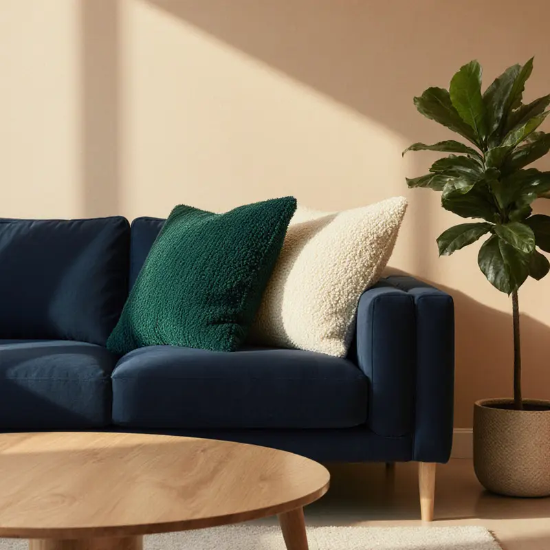
The 2025 design landscape reveals a quiet revolution. We’ve moved beyond the tired debate of bold vs neutral decor for 2025. Instead, designers are weaving both into harmonious tapestries where emerald green accents dance across minimalist backdrops and terracotta whispers warm dining spaces layered with natural wood tones.
Consider a living room where a deep burgundy accent wall anchors neutral linen sofas. Plush velvet curtains in forest green add unexpected luxury while sheer café curtains elegantly diffuse morning light. This isn’t chaos. It’s vertical layering, a deliberate rhythm that balances drama with calm.
Texture becomes the unsung hero. Matte paint finishes and 3D wall panels prevent sterile minimalism, grounding spaces with organic depth. Sustainability breathes through recycled wood beams and non-toxic paints, proving eco-conscious choices needn’t sacrifice beauty.
Colour drenching transforms bedrooms into immersive sanctuaries. In bedroom color drenching, sage to hunter greens saturate walls and ceilings alike, treating that fifth wall as a canvas for intentional serenity. Curved shapes soften edges while bamboo flooring keeps rooms earthy and grounded.
Wellness isn’t a buzzword here. It’s felt in the weight of tactile bedding and the quiet confidence of curated individuality, where bold bursts honor personal stories without overwhelming calm foundations.
Balance is the new benchmark.
As fall 2025 approaches, rich burgundy and forest green blend with cozy textures in layered interiors. Neither style dominates; they elevate. This shift from competition to complementarity prepares us for the next evolution: warm neutrals as living spaces’ soulful foundation.
Rethinking warm neutrals: 2025’s strategic design foundation
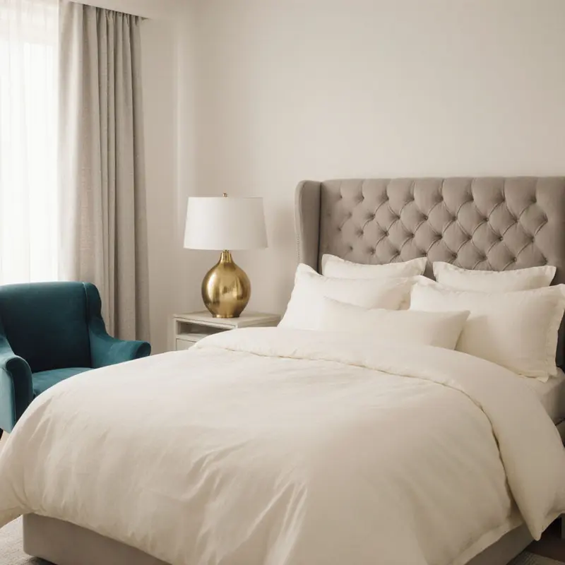
Picture a powder blue sofa in performance fabric, its soft hue blending with a textured linen throw. This isn’t whimsy; it’s the quiet revolution of warm neutrals defining 2025 interiors. Designers have decisively moved beyond stark white-on-white minimalism, embracing organic soft whites like Benjamin Moore White Dove and Sherwin Williams Alabaster. These shades offer subtle warmth, creating inviting spaces that feel lived-in without overwhelming brightness.
The term beige has quietly vanished, replaced by descriptors like Cashmere Kitchen. Pastels such as sage green and powder blue now function as versatile neutrals, layered with warm metals and bold patterns. This nuanced approach, replacing beige descriptors, combines softness and sophistication, proving comfort needn’t sacrifice style.
Fall 2025 introduces warm reds, chocolate browns, and terracotta as leading colors. Yet these bold hues appear only as accent walls or statement pieces, always grounded by neutral furnishings. Texture-focused materials like velvet cushions and linen drapes enhance both tactile comfort and visual depth, countering ultra-minimalism’s decline.
Homes now prioritize authenticity over social media perfection. Warm neutrals serve as timeless foundations, allowing traditional and contemporary elements to coexist. They support personal expression without starkness, transforming the bold vs neutral decor for 2025 debate from a contest into a conversation.
Authenticity is non-negotiable.
With warm neutrals as our anchor, jewel tones and patterns await their strategic spotlight.
Balancing jewel tones: Why bold accents elevate neutral foundations
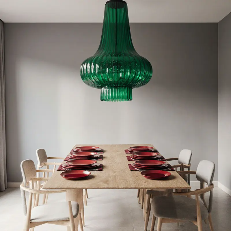
While neutrals anchor 2025 interiors, a decisive shift toward bolder hues makes spaces truly pop. Designers deploy jewel tones like emerald and sapphire with precision, understanding these rich accents shine brightest against sand or beige backdrops. Imagine a Houston client hesitating at an ocean blue velvet armchair; pairing it with walnut wood and olive green textiles turns hesitation into joyful confidence.
This strategic balance creates harmony while injecting personality. Pastels reveal surprising boldness too. A powder blue linen sofa feels daring when layered with metallic finishes and grasscloth textures. Performance fabrics ensure these light statement pieces withstand daily life.
Balance is key.
Vibrant hues soften gracefully when grounded by earthy neutrals, while art and accessories offer resale-friendly flexibility. A single dusty pink throw pillow against warm terracotta walls whispers resonant individuality. Houston’s design scene exemplifies this trend, blending the latest sustainable home decor trends with expressive deep greens and warm terracotta.
The resulting spaces balance personal expression with broad appeal, ensuring longevity in both enjoyment and value.
Here, the bold-neutral dialogue transcends trend, becoming a timeless conversation between hue and hand.
Texture’s quiet rebellion: How layering resolves 2025’s bold-neutral divide
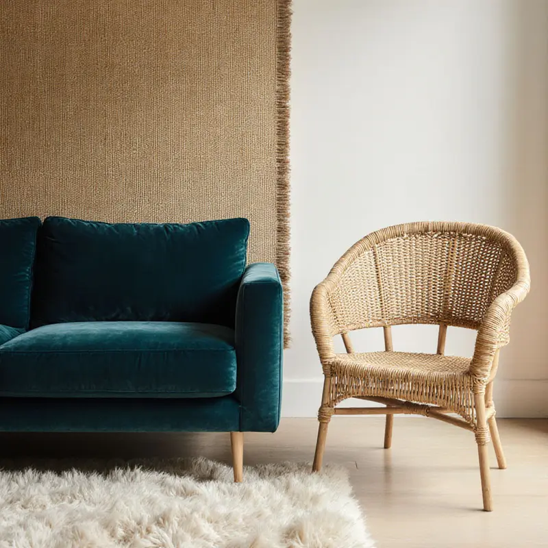
Texture layering tells stories paint cannot capture. For designers navigating bold vs neutral decor for 2025, blending bouclé, grasscloth, and plaster creates depth without visual chaos. Houzz confirms layered textures transform spaces into warm, lived-in sanctuaries that reflect personal style this year.
Consider a living room where a bouclé sofa meets sage green grasscloth wallpaper. Homes and Gardens notes mixing tactile fabrics with aged metals builds dimension, while LetsDecore.com showcases light beige grasscloth for minimalist sophistication. These natural fibers enhance depth through quiet harmony in neutral contexts.
Texture functions like a secret color palette. Earthy browns and rusty reds from The Brownstone Boys’ recommendations on the 2025 fall texture trends cradle plaster walls and wool throws, creating jewel-toned intimacy. Sweet Magnoliaa’s sage grasscloth proves textured wallpapers add dimension through touch alone, bridging bold accents and serene foundations.
Layering isn’t just visual. It’s the rustle of linen beside cool plaster, the nubby warmth of bouclé against smooth wood. This tactile storytelling invites curiosity and comfort.
Each surface holds meaning.
For designers, these elements resolve the central tension: honoring 2025’s bold impulses while preserving neutral calm. The answer lives in texture’s quiet rebellion. It transforms rooms into emotional landscapes.
In every space, texture ensures this conversation resonates with lived-in authenticity.
Balancing bold and neutral: Room-specific strategies for dynamic harmony
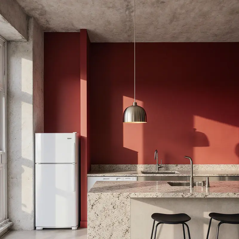
Emerald green cabinetry commands attention in the 2025 kitchen, grounded by warm beige countertops. This isn’t reckless boldness; it’s strategic confidence. Designers anchor spaces with rich terracotta backsplashes or mahogany wood accents, balancing them against earthy neutrals. Sustainability quietly shapes these choices through reclaimed materials that add organic warmth.
Living rooms embrace a nuanced dance. Pastel sofas in soft sage green function as modern neutrals, layered with textured throws and warm metal accents to prevent a washed-out feel. Neutral Maximalism shines through sculptural furniture and tonal variations within the same color family. A single vibrant armchair then becomes the room’s heartbeat, blending calm and energy.
Bedrooms intentionally embrace serene retreats. Earthy taupes and warm whites dominate, layered with organic fabrics and reclaimed wood textures. Pastels like powder blue serve as visually calming backdrops, while tonal ceiling washes deepen the restorative atmosphere.
Each space serves its purpose.
This thoughtful sequencing ensures seamless flow between rooms. By applying bold versus neutral decor with room-by-room precision, designers create homes that feel both dynamic and harmonious.
These room-specific approaches find perfect expression in adaptable kitchen color strategies.
Rethinking color strategy: Bold drenching and neutral anchors for 2026
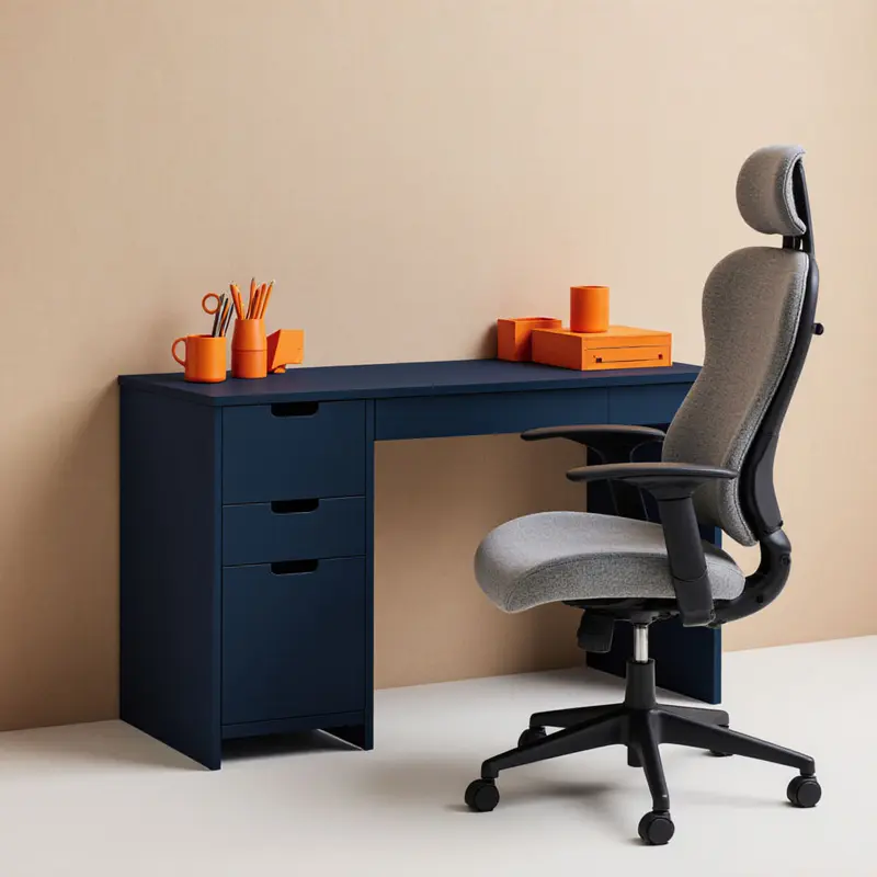
Step into a home that feels alive, not sterile. That’s the power of bold color drenching, surging with a 149% year-over-year spike in listings. For designers, this goes beyond paint. It’s a strategic pivot from 2025’s quiet luxury toward emotionally charged spaces for 2026. Deep indigos, terra-cottas, and moody greens now wrap walls, ceilings, and trim, transforming rooms into immersive experiences.
Consumer fatigue with greige has ignited a craving for vibrancy and texture. The shift is unmistakable.
Hesitant clients need not fear. Start small with a powder room awash in Glidden’s 2026 Warm Mahogany, a rich red-terra cotta hybrid. This creates instant drama without overwhelm. Matte finishes soften its intensity, while gloss amplifies it. Pair it with sage green for whimsy or white for crisp contrast.
Dulux’s Rhythm of Blues collection liberates palettes from rigid rules. It proves bold vs neutral decor for 2025 is evolving into integrated harmony. Consider the emotional duality. Sensual Off White redefines neutrality with warmth, embracing natural materials. Meanwhile, Red Orange pulses with optimism and human connection. This hue shifts between glowing orange and vivid red, energizing modernist sculptures in entryways.
Future-proofing demands both boldness and balance. Think of a cozy reading nook beside a spa bathroom drenched in royal blue. True adaptability merges color strategy with sustainability. Fueled by the color drenching spike, bold palettes signal homes ready for 2026’s emotional landscape, yet neutral anchors ensure longevity. As disaster-ready features rise, your brushstrokes must resonate today and evolve tomorrow.
Design with heart.
Final thoughts
Today’s most resonant interiors honor both bold impulses and neutral calm through strategic layering that feels authentically lived-in. Jewel tones like emerald and sapphire shine brightest against sand backdrops while texture layering tells stories paint cannot capture, blending bouclé and grasscloth to create depth without chaos. This quiet rebellion transforms spaces into warm sanctuaries where tactile storytelling invites curiosity and comfort.
The bold vs neutral decor for 2025 conversation has evolved into timeless harmony, proving personal expression needn’t overwhelm calm foundations. As we move toward 2026, designers will continue merging emotional color drenching with sustainable choices, ensuring spaces resonate with both vibrancy and longevity. True design mastery now lies in creating homes that feel alive today while gracefully evolving for tomorrow’s emotional landscape.
Ready to transform your space with smart, stylish design ideas? Contact OnInitiative.com ([email protected]) today and let our experts help you reimagine home decor with creativity and purpose!
About us
OnInitiative.com is an innovative marketplace that helps e-commerce businesses boost productivity and community growth through advanced automation tools.
Further reading
Leave a comment